experimenting & reflecting - DESTRUCTION!
upon first inspecting the bottle caps, i'd realized that they are visually interesting and very graphic, combining typography with design elements to create bite-sized branding for beverage companies. i chose to experiment with physically altering the shape, appearance and size of the caps - in short, conducting physical experiments.
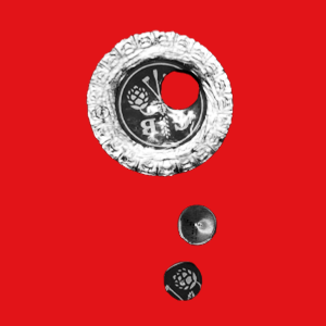
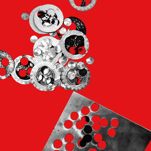
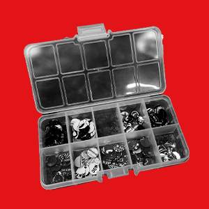
i tried multiple methods of doing so, from flattening them with various tools, to soldering them together, to heating and melting them with the torch. all experiments are documented in better detail in the physical logbook. one experiment that stuck with me was using the punched holes from the flattened bottle caps. the resulting small circles reminded me of sequins due to their shape and shimmer.
i decided that within my project i will be using the bottle caps at face value, simply as design elements with certain colors, typography and illustrations on them. i intended to strip the bottle caps of their original meaning/association to drinking, using them to create an unexpected final product. the result will not have (much) correlation to the material’s original use; i am using the bottle caps as a visual basis.
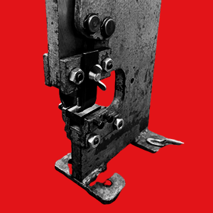
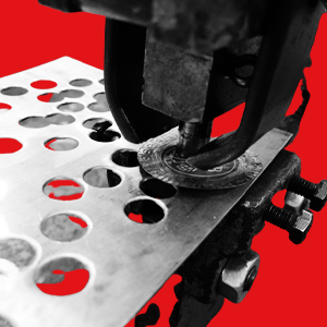
for this, i had to prepare the material, using the method mentioned before. i cut smaller circles out of each bottle cap with a metal hole punch. the circles are punched randomly, except when there is a standout graphic element (ie. heineken caps feature a red star, fritzkola feature a pair of portraits) - in this case, i will take advantage of that.
the process of punching out holes is explained in better detail through the photos on the right side.
i tried multiple methods of doing so, from flattening them with various tools, to soldering them together, to heating and melting them with the torch. all experiments are documented in better detail in the physical logbook. one experiment that stuck with me was using the punched holes from the flattened bottle caps. the resulting small circles reminded me of sequins due to their shape and shimmer.
i decided that within my project i will be using the bottle caps at face value, simply as design elements with certain colors, typography and illustrations on them. i intended to strip the bottle caps of their original meaning/association to drinking, using them to create an unexpected final product. the result will not have (much) correlation to the material’s original use; i am using the bottle caps as a visual basis.
for this, i had to prepare the material, using the method mentioned before. i cut smaller circles out of each bottle cap with a metal hole punch. the circles are punched randomly, except when there is a standout graphic element (ie. heineken caps feature a red star, fritzkola feature a pair of portraits) - in this case, i will take advantage of that.
the process of punching out holes is explained in better detail through the photos on the right side.